

Returns shown in USD. Price source: CoinGecko.
What is Pump.fun's risk, return, and volatility like?
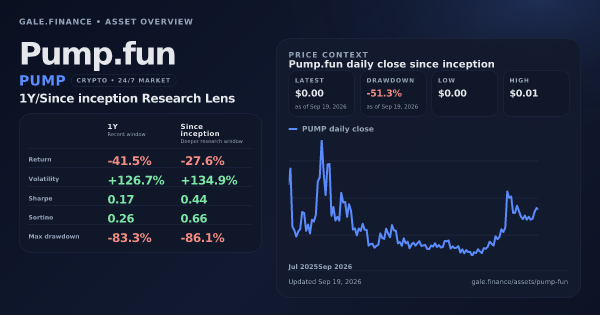
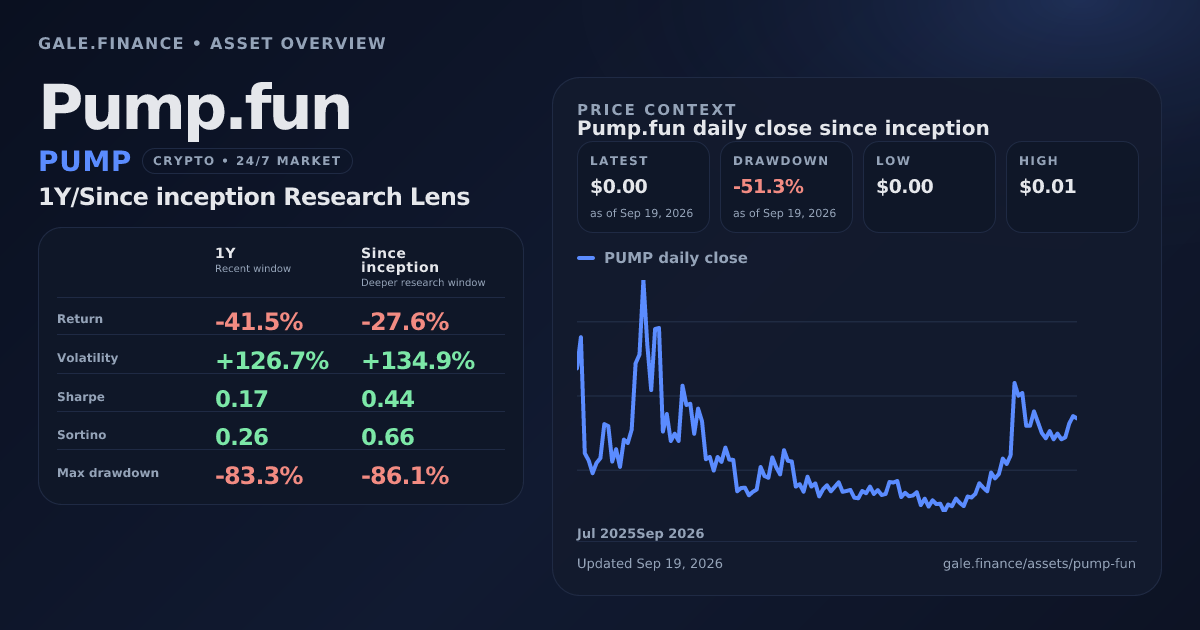
Pump.fun returned -41.5% over the 1Y window. On the Since inception lens, Sharpe ratio is 0.44, annualized volatility is 134.9%, and max drawdown is -86.1%.
Cite This Comparison
"Pump.fun (PUMP): Returns, Risk & Drawdowns." Gale Finance, September 19, 2026. https://www.gale.finance/assets/pump-fun/ Free to use with attribution. Please link back to this page or gale.finance.
Trade PUMP
Access this asset on trusted platforms.
Compare this asset against another in Gale Compare Lab
Price history
Pump.fun price since inception
Track Pump.fun's standalone price path with macro and asset-specific events enabled by default.
Pump.fun price since inception
Key takeaways
- Total Return: PUMP returned -41.5% over the 1Y window and -27.6% over the Since inception window ; annualized return over Since inception was -23.9%.
- Risk-adjusted return: Sharpe was 0.44 and Sortino was 0.66 over Since inception. Sharpe counts total volatility; Sortino focuses on downside volatility.
- Volatility & drawdown: Annualized volatility was 126.7% over 1Y and 134.9% over Since inception ; max drawdown was -83.3% over 1Y and -86.1% over Since inception .
- Tail risk (Expected Shortfall): Over Since inception, daily VaR (5%) was -10.9% and Expected Shortfall was -14.6%. VaR is the cutoff; Expected Shortfall is the average move inside the worst 5% of daily returns.
- Skew & kurtosis: Over Since inception, skew was 0.04 and excess kurtosis was 1.07. Skew shows return asymmetry; excess kurtosis shows how fat the tails were versus a Normal distribution.
- Risk ratios: Sortino Ratio: 0.66 , Calmar Ratio: -0.28 , Sterling Ratio: -0.37 , Treynor Ratio: 0.38 , Ulcer Index: 67.12% .
Pump.fun Drawdown
Max drawdown shows the deepest peak-to-trough decline Pump.fun suffered in each research window. 1Y: -83.3%; Since inception: -86.1%.
Pump.fun is currently -51.3% below its prior peak, with the high-water mark at $0.01. Since inception low is $0.00.
Since inception drawdown episodes
Pump.fun Volatility
Volatility Pump.fun's annualized volatility shows how widely daily closes moved over 1Y and Since inception. Higher values mean a noisier path, not automatically a better or worse investment. 1Y: 126.7%; Since inception: 134.9%.
Benchmark context
Where PUMP fits relative to other lenses
Benchmark links are secondary on this page. Use them when you want to place the asset against a specific market, factor, or historical counterpart.
Default benchmark
Bitcoin
Cross-asset crypto benchmark

S&P 500
Broad equity benchmark
Ethereum
Cross-asset crypto benchmark
Nasdaq 100
Growth and tech benchmark
Risk-adjusted ratios
These ratios compare return against different definitions of risk: total volatility, downside volatility, drawdowns, benchmark beta, and time spent underwater.
Pump.fun Sharpe Ratio
PUMP Sharpe Ratio (Since inception)
Return per total volatilityThe dot sits at (Pump.fun's annualized volatility, its excess annualized return). The slope from the origin to the dot is the Sharpe ratio — steeper means the asset converted risk into return more efficiently.
Sharpe ratio Pump.fun's Sharpe ratio measures excess return per unit of total volatility. Higher readings mean the asset converted risk into return more efficiently over the same window. 1Y: 0.17; Since inception: 0.44.
A Sharpe above 1.0 is generally considered good, above 2.0 is excellent. Negative Sharpe means the asset underperformed the risk-free rate. Calculated on each asset's full 365-day lookback of available prices and annualized using the asset calendar (365 for crypto, 252 trading days for equities/ETFs/metals).
Pump.fun Sortino Ratio
PUMP Sortino Ratio (Since inception)
Return per downside volatilityPump.fun's daily-return distribution over the long window. Days left of the target line are the only ones Sortino penalizes in the denominator — so a distribution with a fat left tail produces a smaller Sortino even at the same mean return.
Sortino ratio Pump.fun's Sortino ratio isolates downside volatility instead of all volatility. It is the cleaner lens when you care more about bad downside moves than upside noise. 1Y: 0.26; Since inception: 0.66.
A higher Sortino is better. It's useful when upside volatility is common (crypto is the obvious example). Calculated on each asset's full 365-day lookback of available prices, using the daily risk-free rate as the target return, and annualized using the asset calendar (365 for crypto, 252 trading days for equities/ETFs/metals).
Pump.fun Calmar Ratio
PUMP Calmar Ratio (Since inception)
CAGR per worst drawdownPump.fun's CAGR bar sits above zero, the max drawdown bar sits below. Calmar is the ratio of those two magnitudes — a shallow drawdown bar with a tall CAGR bar produces a strong Calmar.
Calmar ratio Pump.fun's Calmar ratio measures return per unit of max drawdown. It is useful when the path of losses matters as much as the final return. 1Y: -0.50; Since inception: -0.28.
Calmar is computed on each asset's full 365-day lookback and uses the max drawdown over that same window.
Pump.fun Sterling Ratio
PUMP Sterling Ratio (Since inception)
Return per average drawdownThe underwater curve shows Pump.fun's drawdowns over the long window. Sterling averages every event deeper than the 10% threshold instead of taking only the worst one — so an asset with many mid-size drawdowns scores worse here than on Calmar.
Sterling ratio Pump.fun's Sterling ratio compares return against deep drawdown pressure. It gives a harsher read on assets that compound well but suffer ugly declines along the way. 1Y: -0.54; Since inception: -0.37.
Sterling uses average drawdown events deeper than 10% and subtracts the risk-free rate to report excess return.
Pump.fun Ulcer Index
PUMP Ulcer Index (Since inception)
Drawdown painThe underwater curve shows how deep and how long Pump.fun's drawdowns were. Ulcer is the root-mean-square of that curve — both depth and persistence count, so lower is better.
Ulcer Index Pump.fun's Ulcer Index measures both the depth and persistence of drawdowns. Lower is better because it means fewer and shallower underwater periods. 1Y: 64.97; Since inception: 67.12.
Ulcer Index is computed from each asset's drawdown series over the full lookback window.
Pump.fun Treynor Ratio
PUMP Treynor Ratio (Since inception)
Excess return per beta vs BTCThe line's slope is Pump.fun's beta to BTC — steeper means more market-sensitive. Treynor divides excess return by that slope, so an asset can look efficient with a shallow beta and a small return, or inefficient with a steep beta and a big return.
Treynor ratio measures excess return per unit of market beta versus BTC. A high Treynor means the asset compensated its market exposure well over this window. A low or negative Treynor means the asset's market risk wasn't rewarded.
Treynor uses beta vs the S&P 500 (SPY) on shared dates and the average 3-month Treasury rate as the risk-free rate.
Pump.fun Tail Risk
Tail-risk stats use daily return distributions rather than simple end-point returns. They show how ugly the left tail has been, how severe the worst 5% of days were, and whether returns were skewed toward outsized upside or downside shocks.
The histogram shows the shape of Pump.fun's daily log returns over the Since inception window. Bars left of the 5% VaR marker are the worst 5% of days; the ES marker is the average loss inside that tail. Skew and excess kurtosis describe whether the distribution is symmetric around zero and whether extreme days are more common than a Normal distribution predicts.
PUMP daily return distribution (Since inception)
PUMP daily return distribution (Since inception)Log-return histogram with Value-at-Risk and Expected Shortfall markers at the 5% left tail.
| Metric | 1Y | Since inception |
|---|---|---|
| VaR (5%) | -10.4% Historical daily threshold | -10.9% Historical daily threshold |
| Expected shortfall (5%) | -13.3% Beyond the VaR threshold | -14.6% Beyond the VaR threshold |
| Skew | 0.11 | 0.04 |
| Excess kurtosis | 1.66 | 1.07 |
Less negative daily VaR and Expected Shortfall values mean the left tail was less violent. Skew and excess kurtosis help distinguish between steady compounding and a path dominated by occasional extreme moves.
Full stats table
Every window-consistent research metric
Each column keeps the same horizon across returns, ratios, drawdowns, and tail-risk metrics.
| Metric | 1Y Recent window | Since inception Deeper research window |
|---|---|---|
| Total return | -41.5% | -27.6% |
| Annualized return | -41.6% | -23.9% |
| Volatility | 126.7% Annualized daily closes | 134.9% Annualized daily closes |
| Sharpe ratio | 0.17 | 0.44 |
| Sortino ratio | 0.26 | 0.66 |
| Calmar ratio | -0.50 | -0.28 |
| Sterling ratio | -0.54 | -0.37 |
| Ulcer Index | 64.97 | 67.12 |
| Max drawdown | -83.3% 2025-09-19 to 2026-06-25 | -86.1% 2025-09-15 to 2026-06-25 |
| VaR (5%) | -10.4% Historical daily threshold | -10.9% Historical daily threshold |
| Expected shortfall (5%) | -13.3% Beyond the VaR threshold | -14.6% Beyond the VaR threshold |
| Skew | 0.11 | 0.04 |
| Excess kurtosis | 1.66 | 1.07 |
What viewers usually ask next
What is Pump.fun's Since inception CAGR?
Pump.fun's since inception cagr is -23.9% on Gale using the since-inception window.
What is Pump.fun's 1-year volatility?
Annualized volatility is 126.7% over the past year.
What is Pump.fun's since-inception Sharpe ratio?
Pump.fun's Sharpe ratio is 0.44 using the since-inception window.
What is Pump.fun's since-inception Sortino ratio?
Pump.fun's Sortino ratio is 0.66 using the since-inception window.
What is Pump.fun's since-inception Calmar ratio?
Pump.fun's Calmar ratio is -0.28 using the since-inception window.
What is Pump.fun's since-inception Sterling ratio?
Pump.fun's Sterling ratio is -0.37 using the since-inception window.
What is Pump.fun's since-inception Ulcer Index?
Pump.fun's Ulcer Index is 67.12 using the since-inception window. Lower is better because it means shallower and less persistent drawdowns.
What is Pump.fun's since-inception max drawdown?
Max drawdown is -86.1% over the since-inception window from 2025-09-15 to 2026-06-25.
What is Pump.fun's since-inception daily Value at Risk?
Using historical daily returns, Gale estimates a 5% Value at Risk of -10.93% over the since-inception window.
What is Pump.fun's since-inception Expected Shortfall?
Expected Shortfall is -14.58% over the since-inception window, which captures the average outcome inside the worst 5% of daily returns.
Is Pump.fun still below its all-time high?
Current drawdown is -51.3% versus the all-time high of $0.01 reached on 2025-09-15.
Which benchmark should viewers open first for Pump.fun?
Bitcoin is the default benchmark lens on Gale because it gives the cleanest context for Pump.fun's recent behavior.